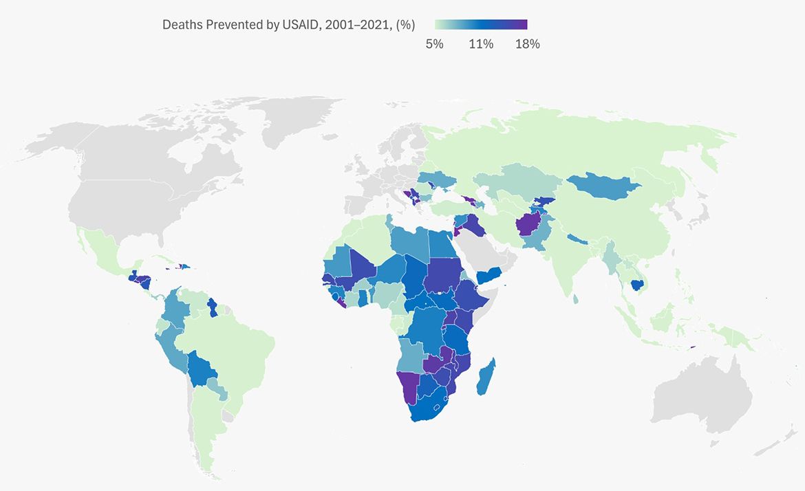
World map showing the percentage of deaths prevented by USAID from 2001 to 2021, with countries shaded in a blue-to-purple gradient ranging from 5% to 18%. Sub-Saharan Africa and parts of South Asia show the highest rates of deaths prevented.
UCLA Fielding School of Public Health
A global map showing deaths prevented by USAID